This was done as an assignment.
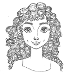
I started with drawing out several small sketches of my ideas for the ad. Until I had two thumbnails that I was happy with.
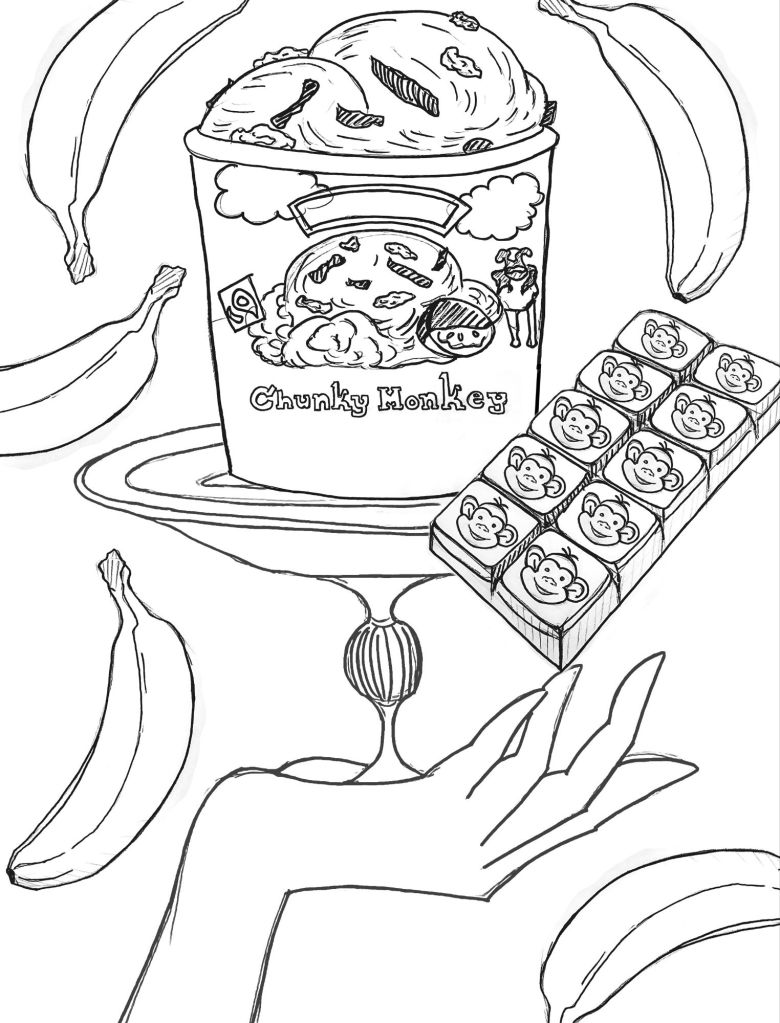

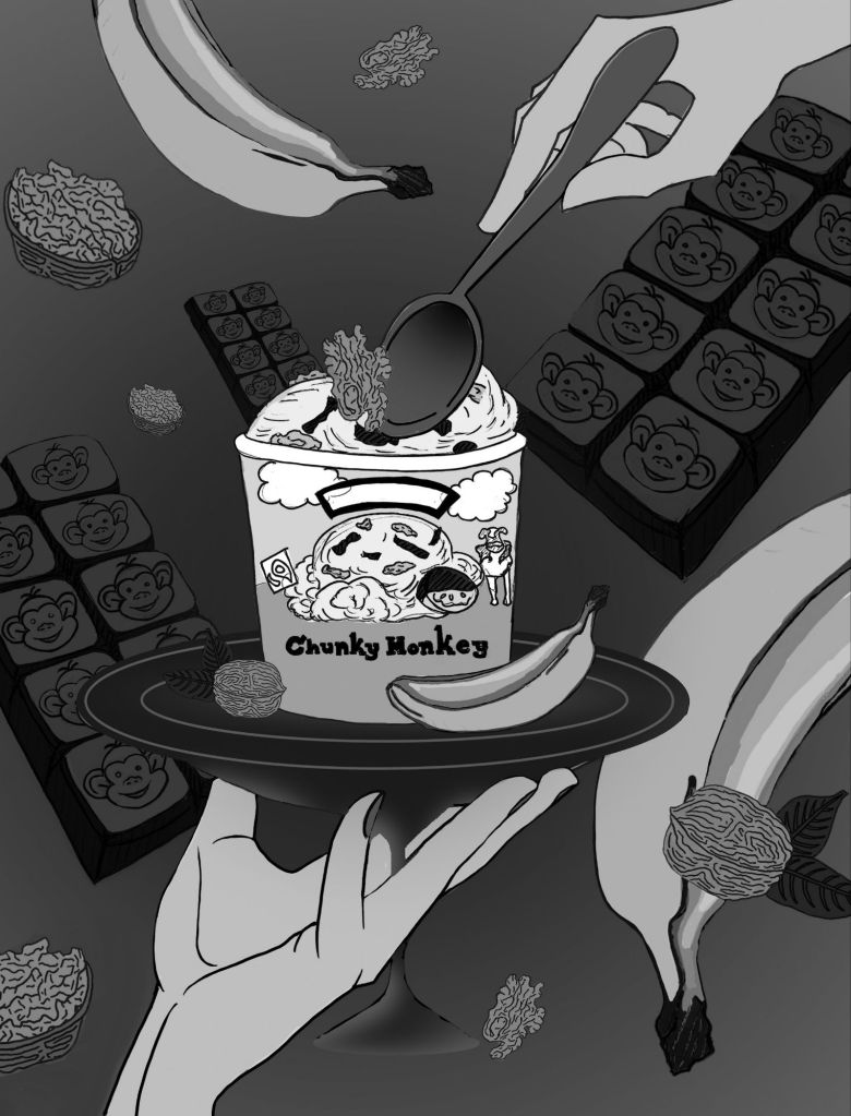
I ended up sticking with Thumbnail 1. The next step was to refine the thumbnail. There were too many bananas, so I added walnuts and more monkey chocolate bars. To balance out the hand at the bottom, I also added the hand at the top with a spoon.
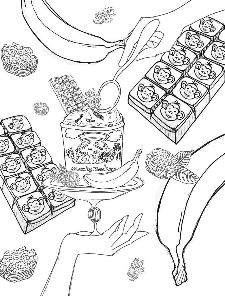
Now that the sketch is more refined, it was easier to see where the design needed to go. There are still some things that need to be adjusted. To make the ice cream the focus of the design, it needed to be bigger. So, I adjusted the hand and platter so I could increase the size of the ice cream carton. I also started mapping out the values for the design.
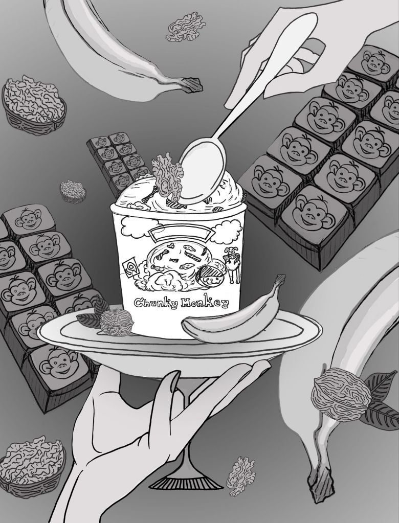
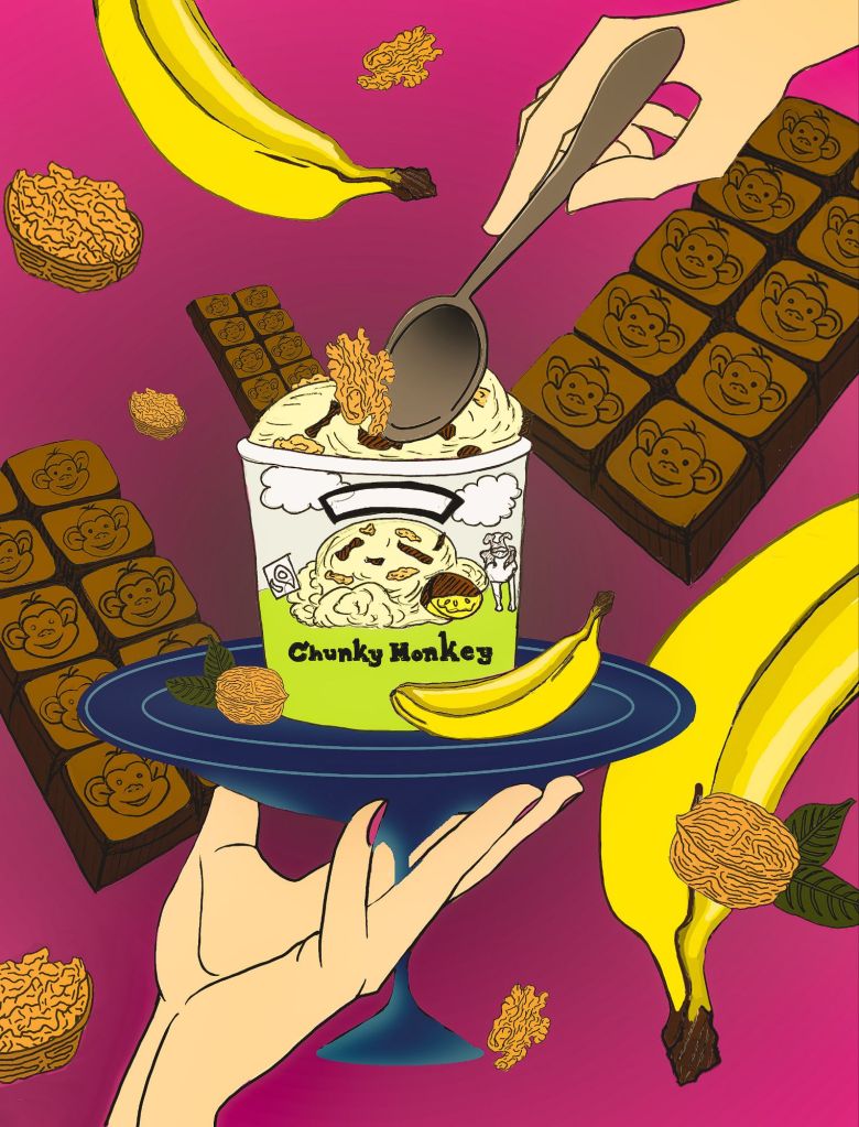
I went with the second option. It was time to start playing with color. I mapped out the colors matching them to the values in the value sketch.
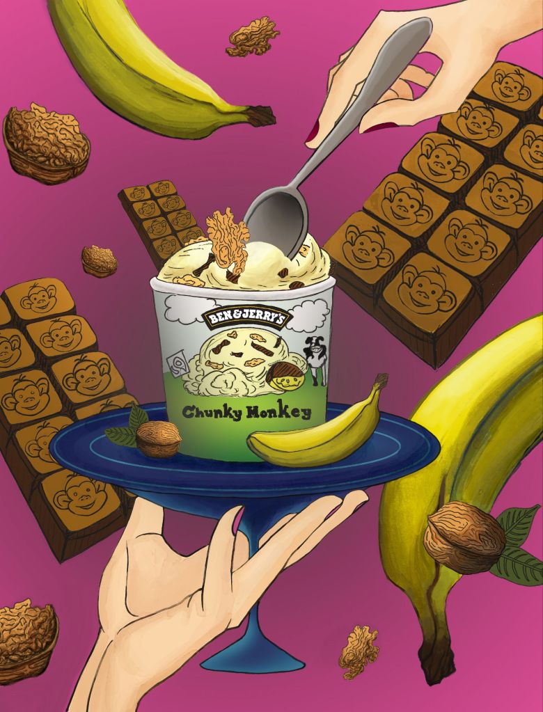
I was happy with the colors, so now it was time to take the design to finish. I decided to go with a painted look. I used a digital watercolor brush to complete the design and add all the details.
Thanks for checking out my work! I appreciate your interest!!